Blomstertid
A Swedish summer festival tour

What
After the pandemic pause, Blomstertid became Sweden’s long-awaited return to festival season. I created the visual identity, website, and all supporting materials using bright colours, expressive type, and enough flowers to live up to the name.
(01) Visual identity
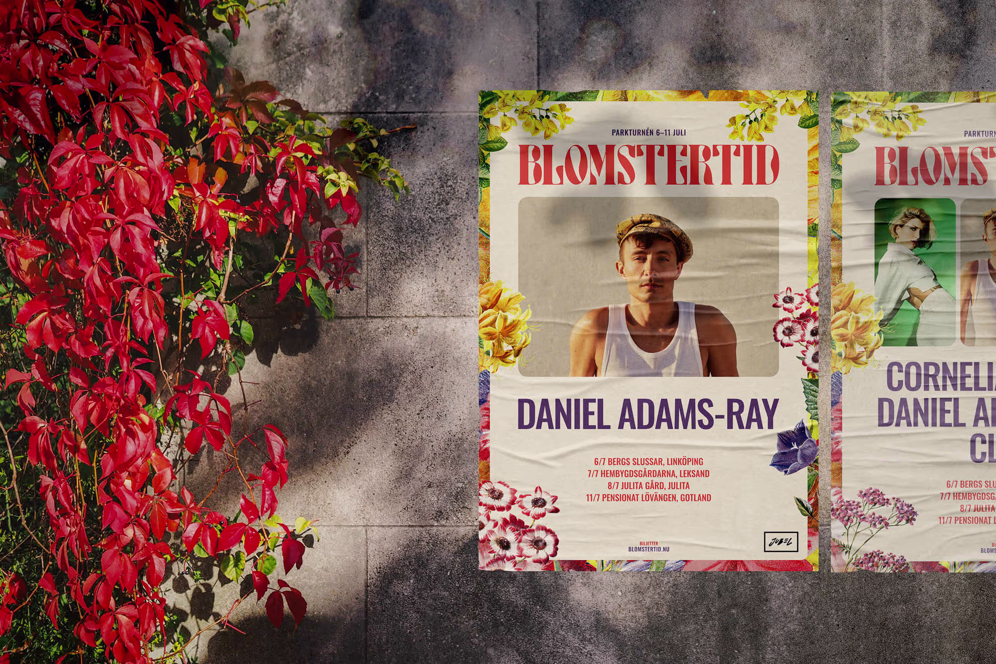
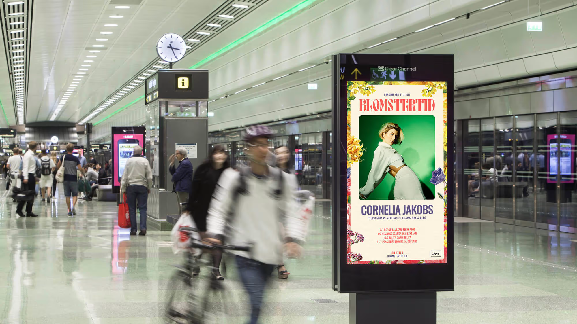
The visual identity was built around bright colours and expressive typography — something that could cut through the noise and work consistently across all channels. It needed to feel energetic without tipping into chaos, and still be flexible enough for everything from posters to social.


01) Print and digital
The identity carried through into the print posters and the digital screens placed around each city on the tour. These were designed to be bold, easy to recognise, and readable from a distance — basically making sure the festival was impossible to miss.
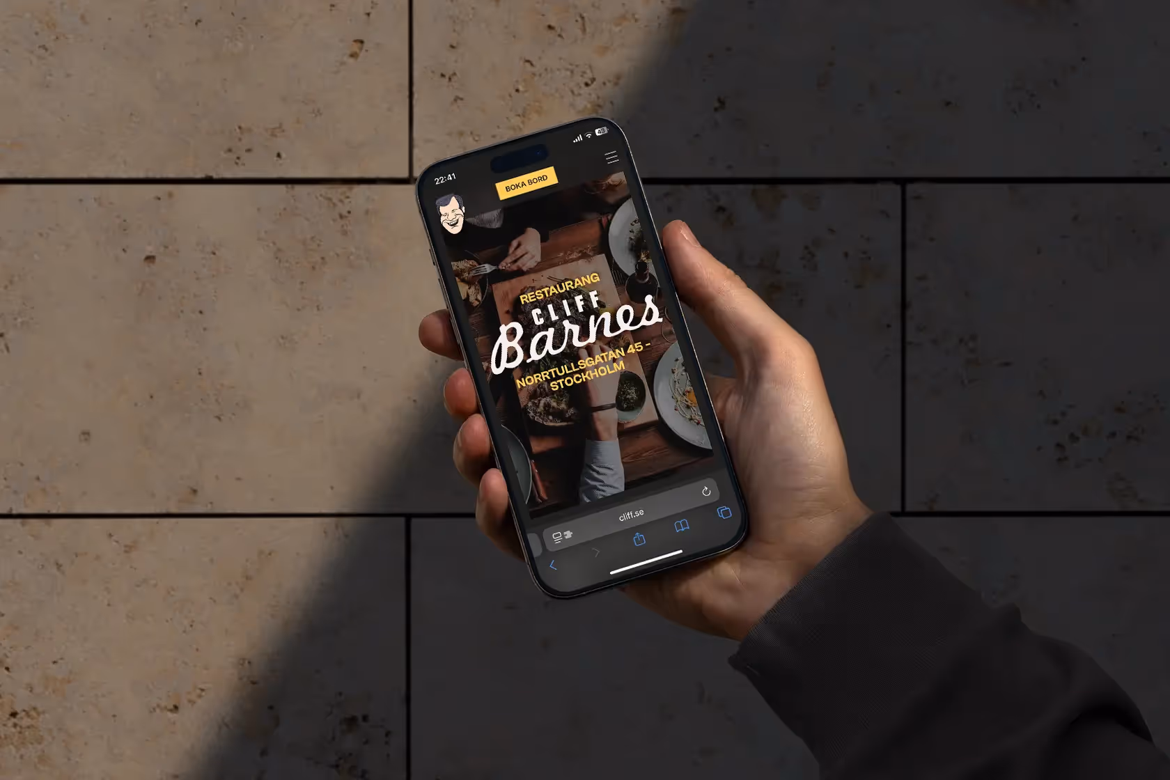
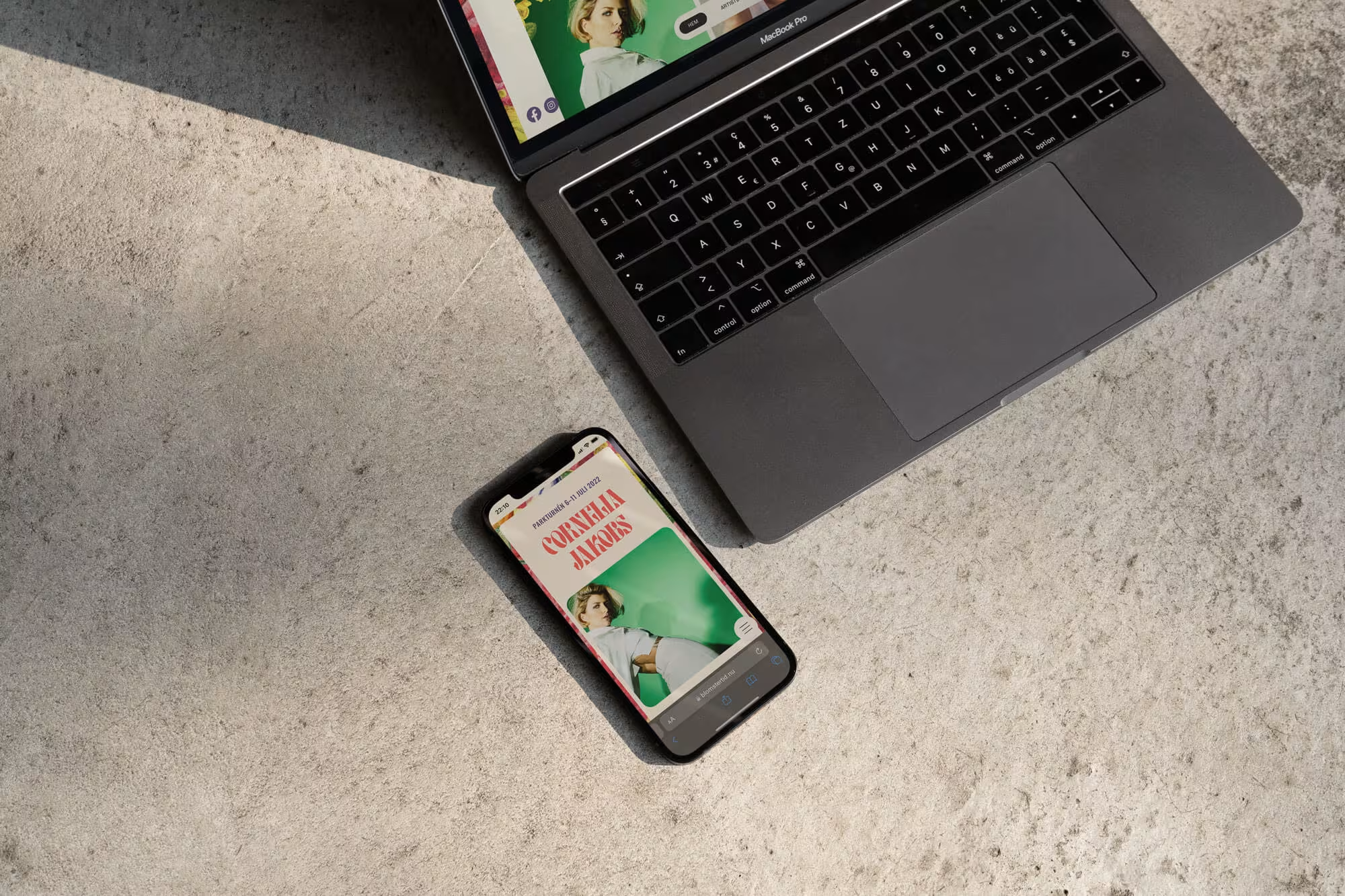
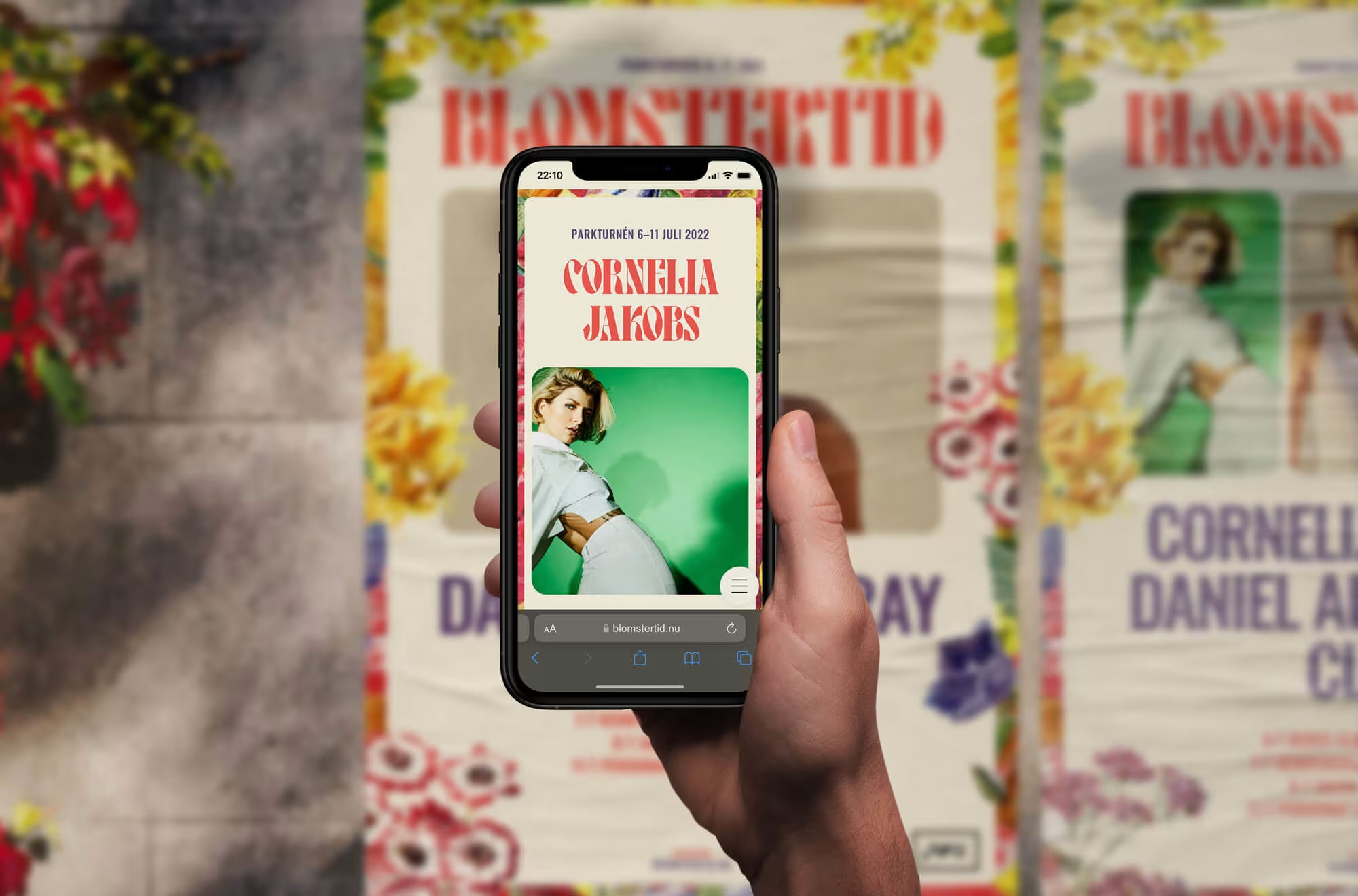
(02) Website
The website extended the festival identity into a clear, straightforward information hub. It gave visitors the essentials: tour dates, locations, a quick look at the artists and their music, and links to buy tickets. The aim was to keep everything easy to find and visually consistent with the rest of the campaign.


More work
Because clients come first